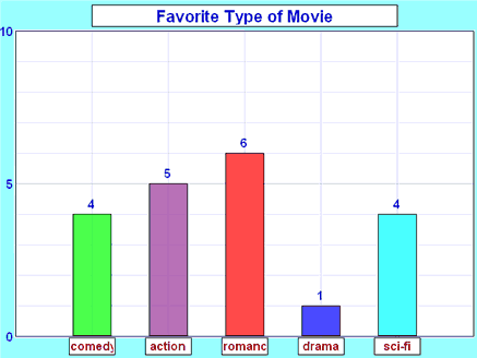
It is a really good way to show relative sizes: we can see which types of movie are most liked, and which are least liked, at a glance.
We can use bar graphs to show the relative sizes of many things, such as what type of car people have, how many customers a shop has on different days and so on.
Imagine you just did a survey of your friends to find which kind of movie they liked best:
| Table: Favorite Type of Movie | ||||
| Comedy | Action | Romance | Drama | SciFi |
|---|---|---|---|---|
| 4 | 5 | 6 | 1 | 4 |
We can show that on a bar graph like this:
Example: Nicest Fruit
A survey of 145 people asked them "Which is the nicest fruit?":
| Fruit: | Apple | Orange | Banana | Kiwifruit | Blueberry | Grapes |
| People: | 35 | 30 | 10 | 25 | 40 | 5 |
And here is the bar graph:
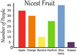
That group of people think Blueberries are the nicest.
Bar Graphs can also be Horizontal, like this:
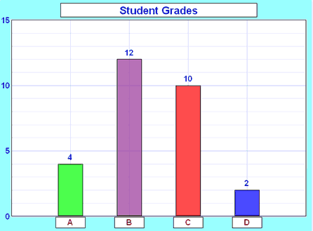
Example: Student Grades
In a recent test, this many students got these grades:
| Grade: | A | B | C | D |
| Students: | 4 | 12 | 10 | 2 |
And here is the bar graph:
Dear Akash your posts today are really good especially your testing section. Congrats keep it up and hope to see content of this quality on your page. Regards.
ReplyDeleteDevinder